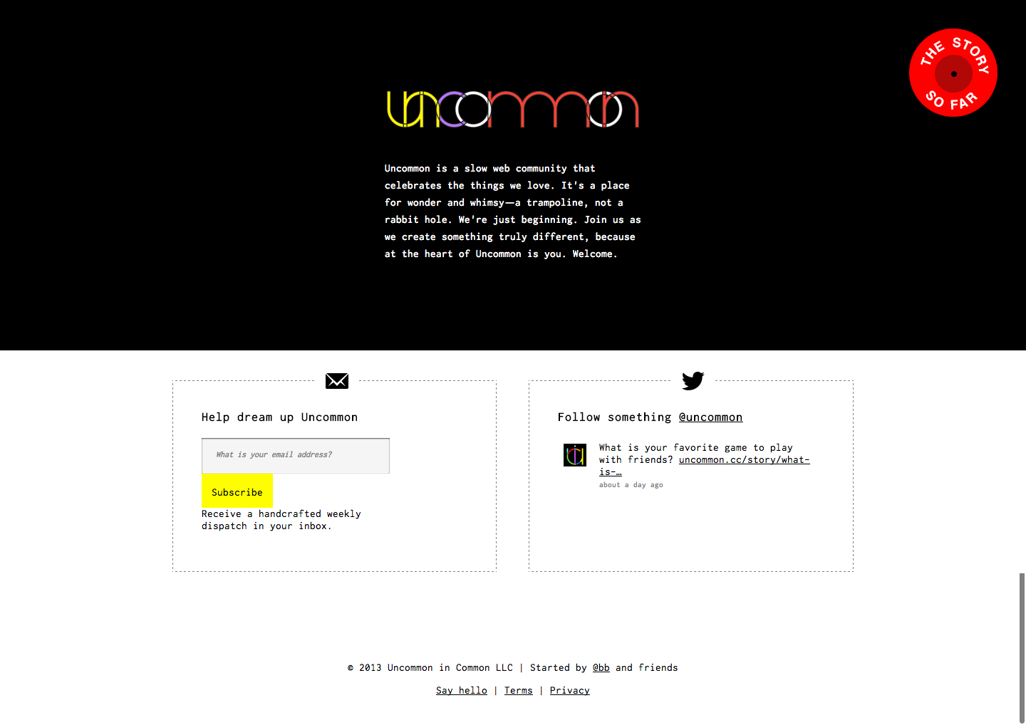
The Site
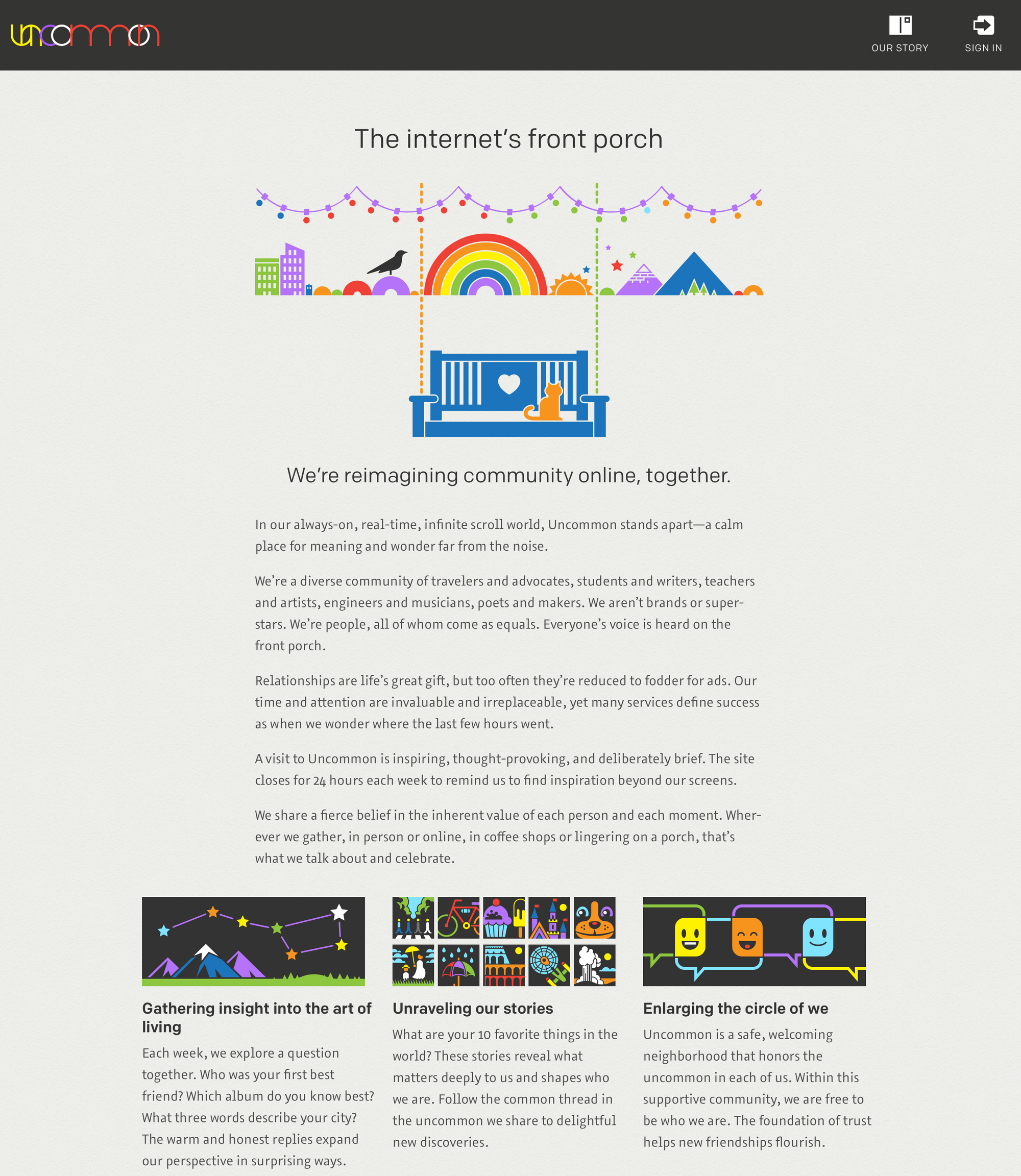
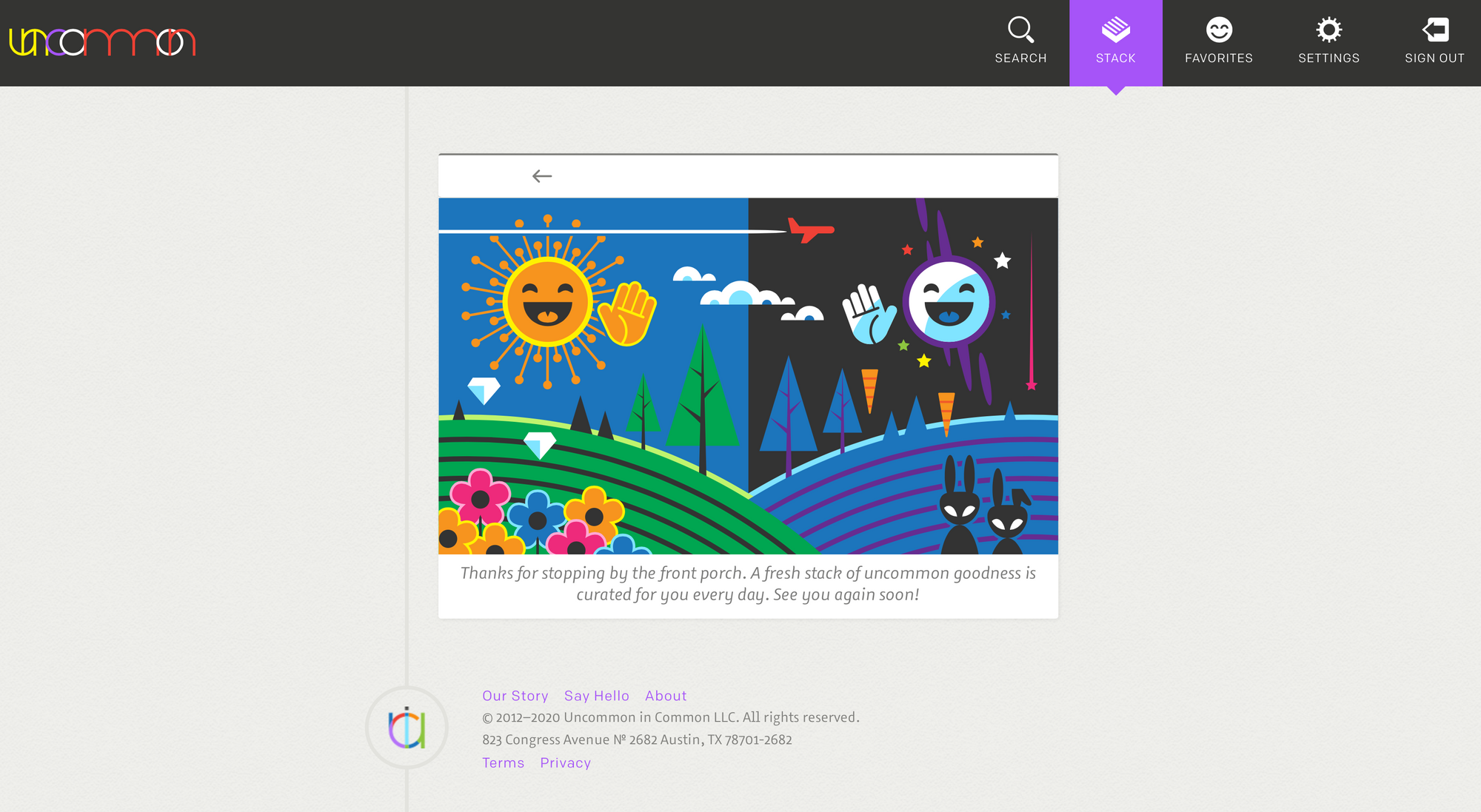
Uncommon's online home was a trampoline, not a rabbit hole. The goal was for visits to be rewarding, but short. Members were greeted by a small stack of cards, such as an introduction to another member, prompt reply, favorite thing, and a writing prompt. The final card was a thank you for stopping by rather than an infinite scroll spinner.
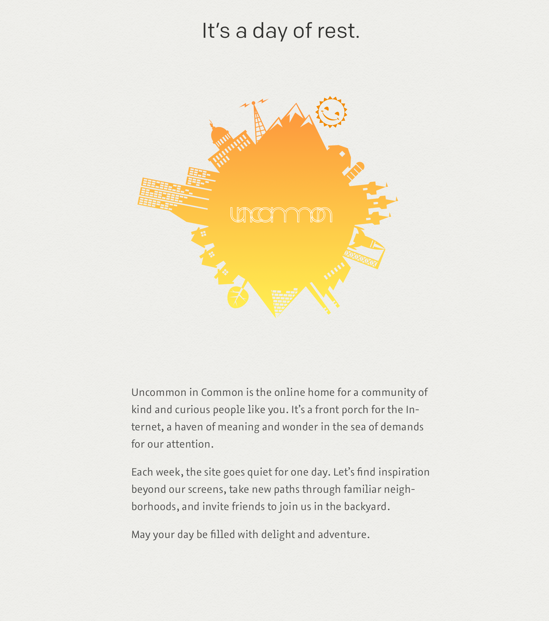
The site also closed for 24 hours each week to encourage us to step away from our screens and find community in other ways.
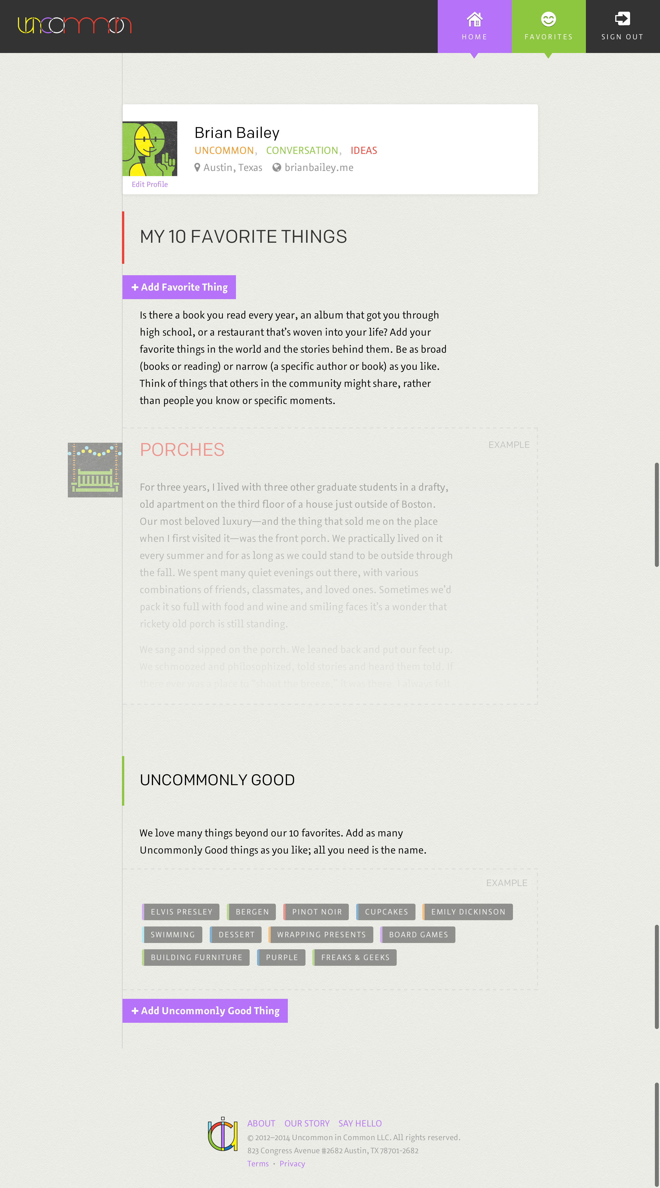
There were other twists. We encouraged members to think differently about the standard profile bio by making it just three words. We shared our favorite things, but only ten.
The site included a page for each favorite thing I’d love to share screenshots of favorite thing pages, but what members shared with the community was intended to be private., so you could see everyone who had the favorite in common, along with what they wrote about it. Reading multiple perspectives on a book, album, hobby, and more was an amazing experience. These weren't reviews—each person cared deeply about this thing, enough to write about why it's one of their favorite things.
There was also a page for each prompt and its replies.
The key design decision was also the earliest: the site would have no numbers. Each profile, favorite, prompt reply, and stack would be exactly the same.
We also didn’t introduce anxiety if you were away from Uncommon for weeks or even months. Your stack stayed the same size regardless. There wasn’t a pile of unread notifications waiting for you; it was impossible to fall behind on Uncommon.
Enjoy this look at uncommon.cc.
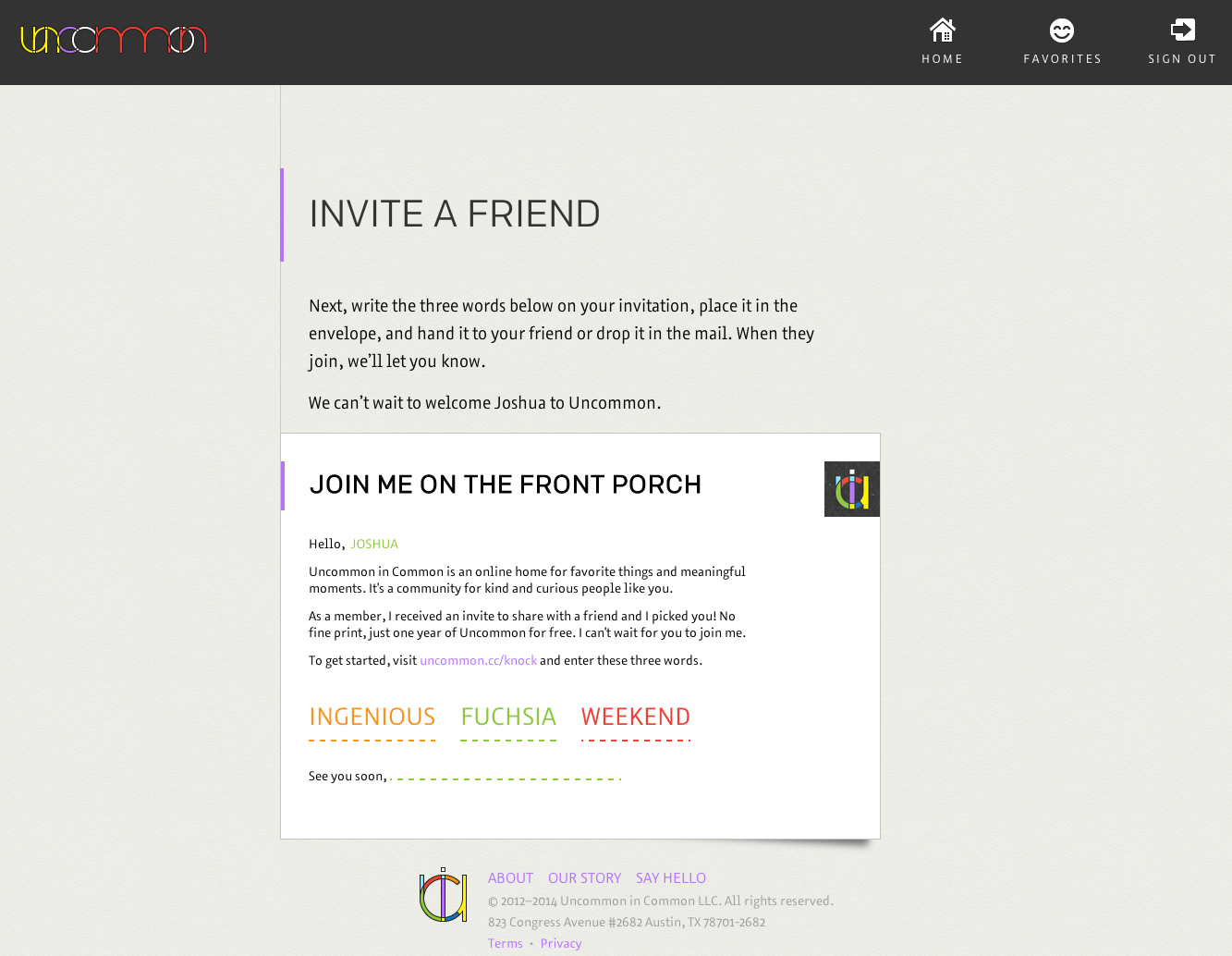
Invite and Knock
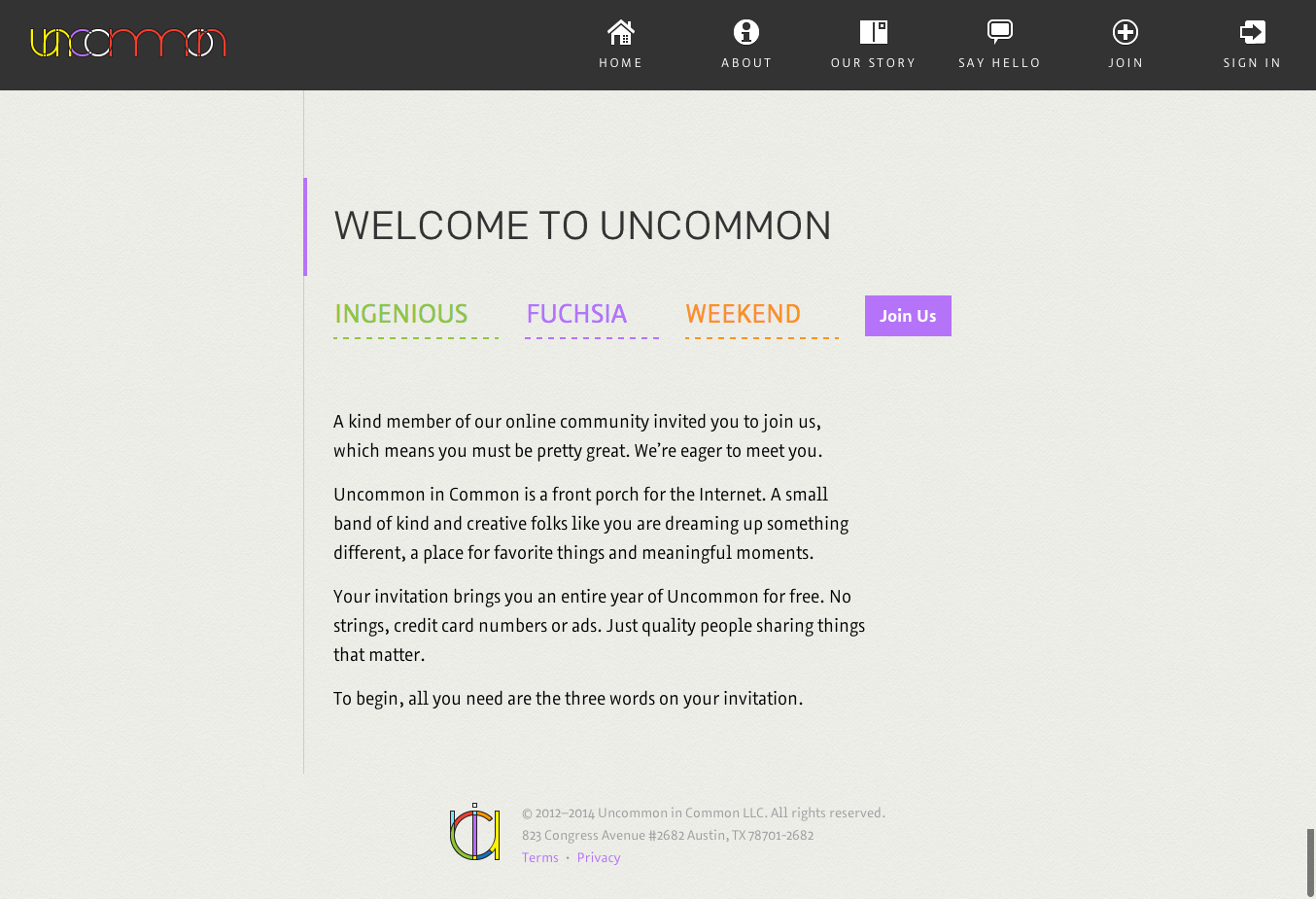
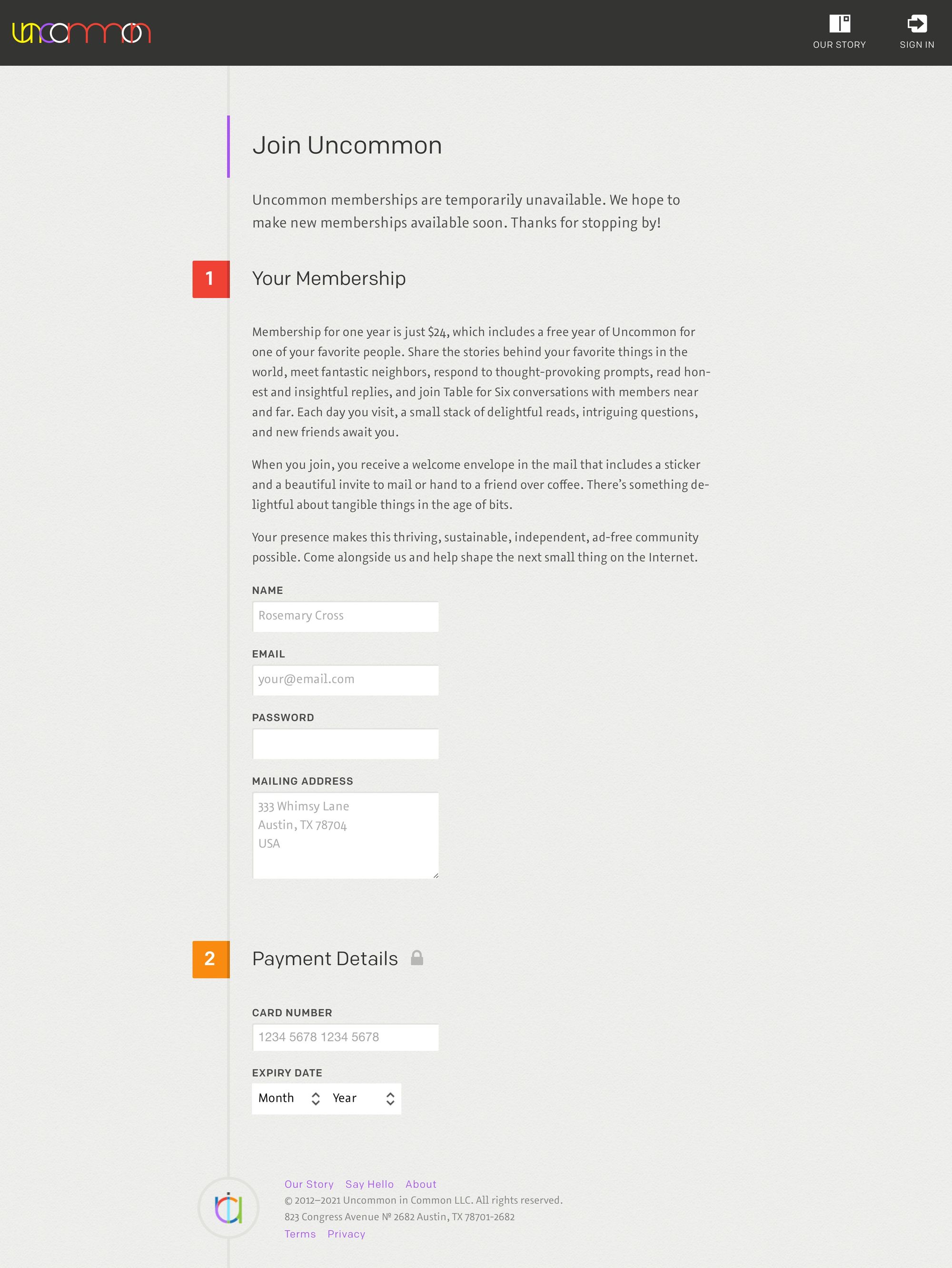
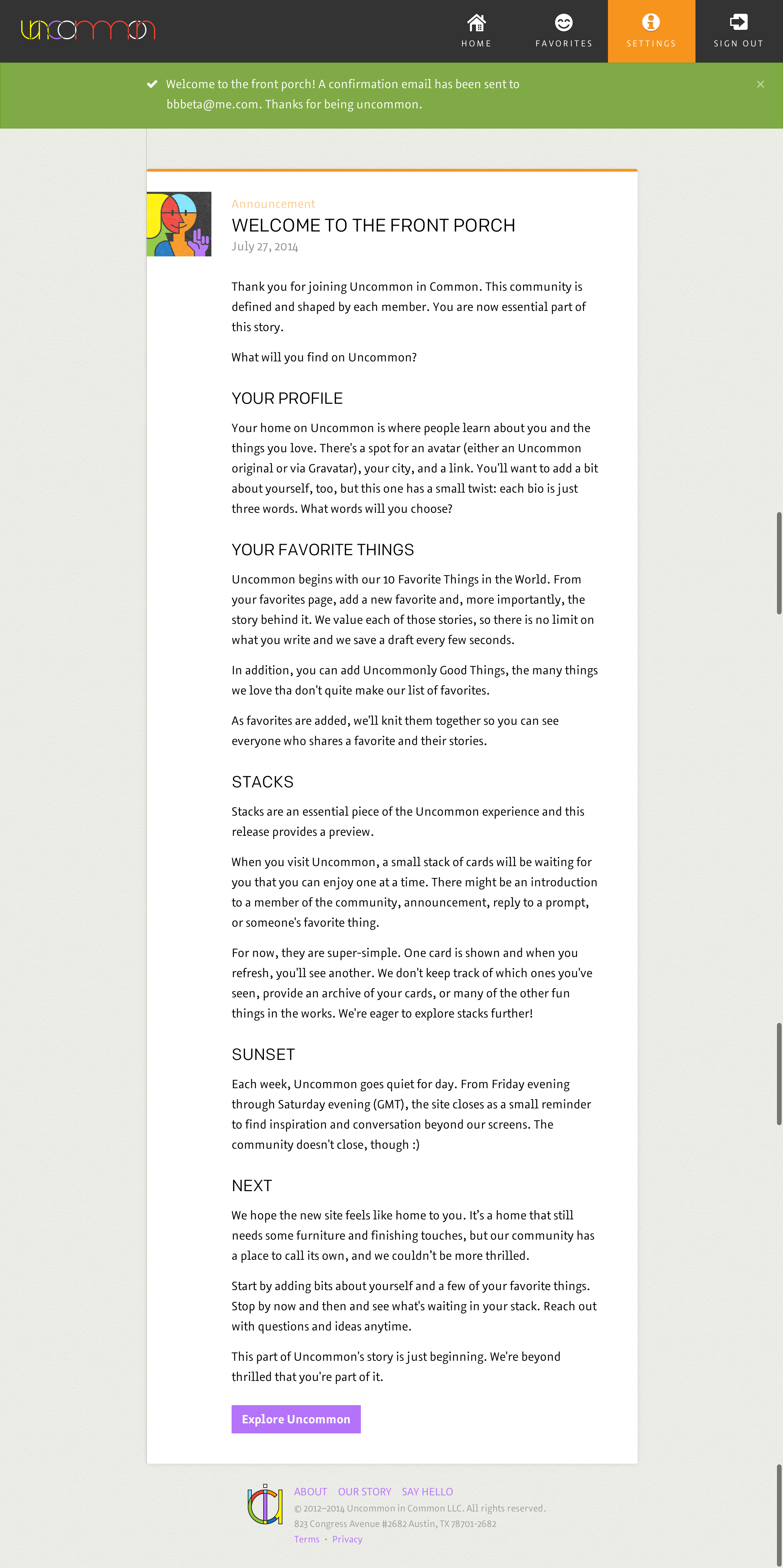
Become a Member
Profile

Stacks
Sunset
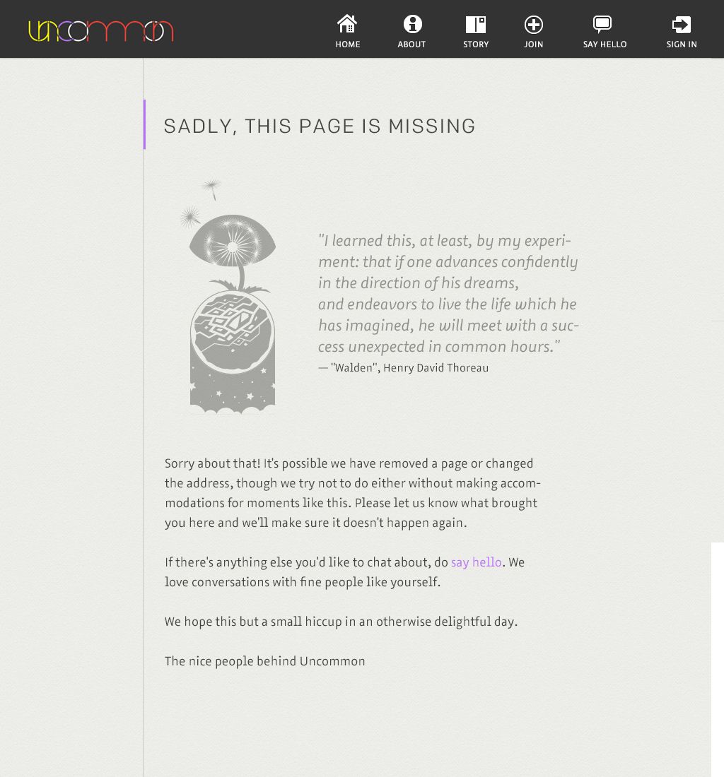
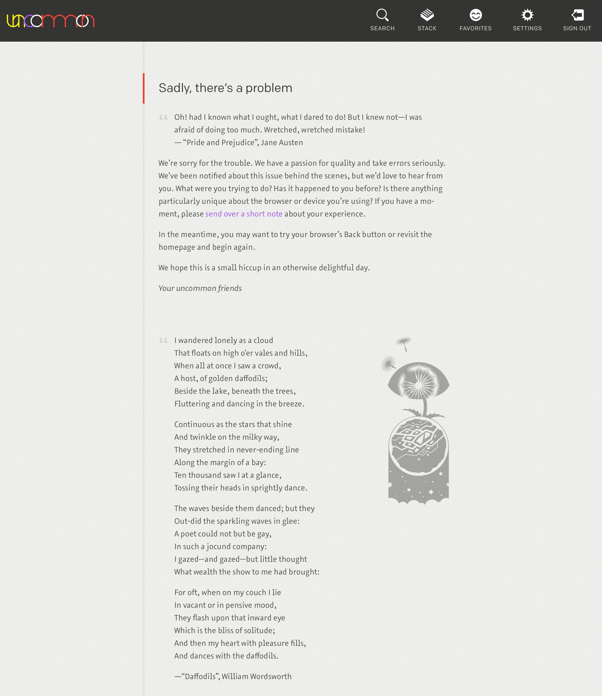
Error Pages
The Beginning
